We are pleased to announce that our school website has been completely re-written using the principles of Responsive Web Design (RWD) in order to provide the best user experience regardless of the device on which you are viewing it.
Over the past few years there has been a steep rise the the number of people visiting our website with modern mobile devices such as smart phones and tablets. It had become evident that the existing design did not facilitate the easy access to information on small hand-held devices which, with the latest technology, it could.
By employing these new technologies we hope to have achieved a device agnostic website which is intuitive, fast, attractive and future-proof and which provides a useful resource for parents, teachers, pupils and the wider community.
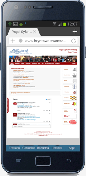
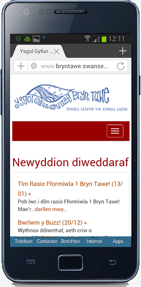
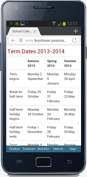
Before and after images on a smart phone:
Technical Specifications
For those interested the in technical details the site has been built using the following technologies:
- HTML5
- CSS 2.1 & CSS3
- CSS Media Queries
- jQuery
with fall-back for Internet Explorer 8 provided by html5shiv.js & respond.js

The development process was driven by a “mobile-first”, RWD approach with a strict adherence to Web Standards and Accessibility. The main development tools used were Sublime Text 3, Github and Grunt. Images were prepared using Adobe Fireworks.
The site was hand-coded by Andy Mabbutt of Pontbren Web Services who is happy to answer any technical questions or resolve any issues you may have using the site.
If you have any ideas about how we can improve this site or information which you think we should include, please contact us.
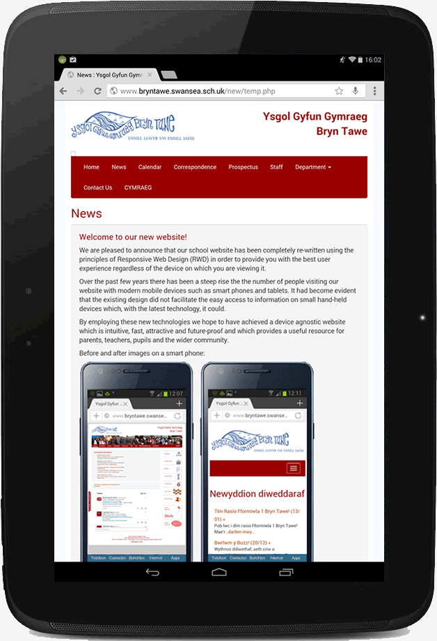
Our new website on a 10 inch tablet in portrait mode: